Faraday probability scores: Improving prediction accuracy through model calibration
How model calibration helps Faraday improve customer prediction accuracy through probability scores.


Faraday’s data science team has made significant improvements to the accuracy and interpretability of customer predictions within the platform; we’re going to give you a peek under the hood at how Faraday predictions are made.
The data science team introduced a process called model calibration, which measures how well the model's predictions match the actual outcomes. This method of calibration results in probability scores; predictions that are even more accurate and easier to interpret. Let’s take a look at a model report to break down the changes.
Lift and precision before model calibration
In the below pre-calibration graphic, note the large dip in the lift curve (red arrow). With this lift curve, the top deciles of propensity scores, or the people you’d generally be targeting with a marketing campaign based on these results, have lower lift in the population (green square), indicating that there’s room for improvement.
A lift curve with strong predictability should show a more gradual dip than you see below. Similarly, the positive attainment cohort home and living (blue square)–or the outcome you want to predict for–is very close to 50%, which could also be improved through model calibration. This would result in pipeline deployments having, say, a Jane Doe with a 0.8 score that could be interpreted as pretty likely to achieve the outcome.
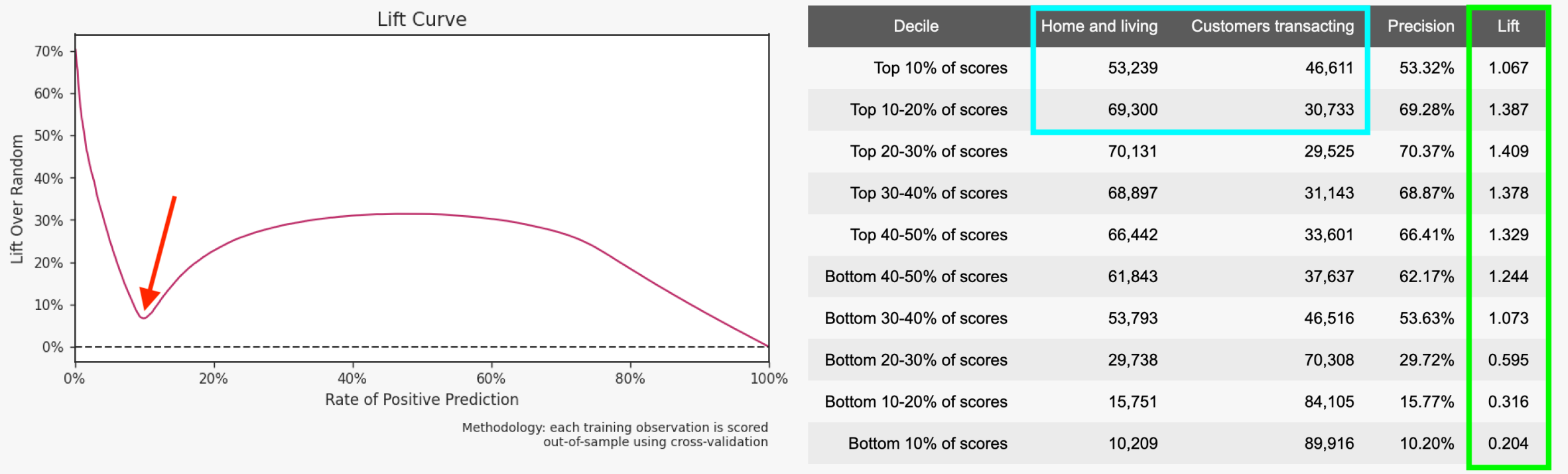
The above graphic displays a predictive model report pre-calibration. Model reports can be found in an outcome's analysis view.
Because Faraday uses multiple predictive models to create an outcome, it makes more sense to compare scores across models rather than treat scores from different models equivalently.
Lift and precision with model calibration
Now, with model calibration implemented in the below graphic, the lift curve’s dip (red arrow) is much less significant for the top deciles, resulting in an outcome that has a higher positive attainment (blue square) in home and living.
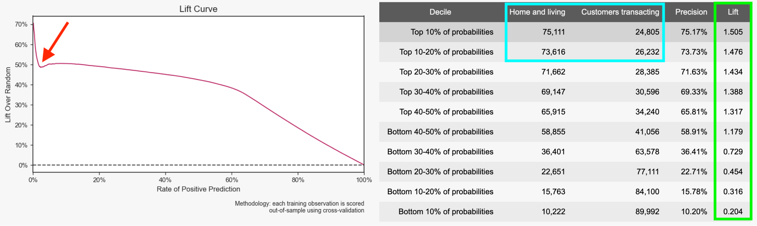
The above graphic displays a predictive model report post-calibration. Model reports can be found in an outcome's analysis view.
So what does this mean? With probability scores, the groups of your prediction’s population–the deciles–are ranked in decreasing lift values, resulting in higher lift in your top attainers, or the people most likely to achieve the outcome.
With this update, Faraday’s predictions give you probability scores that are directly correlated to the probability of an individual achieving your outcome. If Jane Doe in your population has a 0.8 probability score, there’s an 80% chance that she will achieve the outcome.
Marketing campaigns have never been so predictable.
Andy Rossmeissl
Andy Rossmeissl is Faraday’s CEO and leads the product team in building the world’s leading context platform. An expert in the application of data analysis and machine learning to difficult business challenges, Andy has been running technology startups for almost 20 years. He attended Middlebury College and lives with his wife in Vermont where he lifts weights, makes music, and plays Magic: the Gathering.

Ready for easy AI?
Skip the ML struggle and focus on your downstream application. We have built-in demographic data so you can get started with just your PII.