All blog posts
Product
Getting started with Faraday
How to shape your deployments: a guide to filters, formats, and more
A practical guide to customizing Faraday deployments—from filters and formats to geography and output structure—so your predictions arrive ready for action.


David Small &
Ben Rose
on
This post is part of a series called Getting started with Faraday that helps to familiarize Faraday users with the platform
If you read our last blog, What’s in a deployment? How to read your Faraday outputs, you’ve already figured out what comes out of Faraday; now it’s time to understand how to shape it. While that post broke down the different types of payloads you can get from Faraday, this time, we’re going one level deeper: into the deployment settings themselves.
Think of this as a user-friendly guide to all the options you might see when setting up a deployment—from filters to formats, geography to structure, and beyond. These settings help ensure that your predictions don’t just look good in a spreadsheet—they’re ready to plug into your actual tools, from CRMs to ad platforms.
If you've ever wondered what settings like "representation format," "add geometry," or “deployment analysis” actually do—or how they impact your final output—this blog is for you.
But first, what’s a deployment again?
Deployments (called “targets” in the API) are how you tell Faraday where to send your predictions and what those predictions should look like when they arrive. They’re created within a pipeline and allow for detailed customization to make sure the output fits your intended use case—whether you’re running a digital ad campaign, syncing data back into a CRM, or creating a list for direct mail.
1. Where your predictions go
The first decision you make when creating a deployment is choosing its destination. This could be a Faraday-managed connection (like your CRM, ESP, or ad platform), a location in your own infrastructure (like a cloud bucket or database), or just a downloadable CSV. This is the foundation—everything else shapes what gets delivered. If you’d like to see a CSV broken down, check out that last blog we mentioned!
2. What your predictions look like
Representation format
In the app, we define this as the following: “Choose how you want the pipeline's output to be formatted for this target."
Think of representation format as the style or privacy level of your output—whether it’s raw, anonymized, or summarized. Deployments can be configured in a few different formats depending on how you plan to use the data:
- Hashed: This is the default format, typically used for ad platforms. PII is hashed to protect identity while allowing for matching.
- Referenced: This format lets you use your own internal identifier to merge the data back into your system.
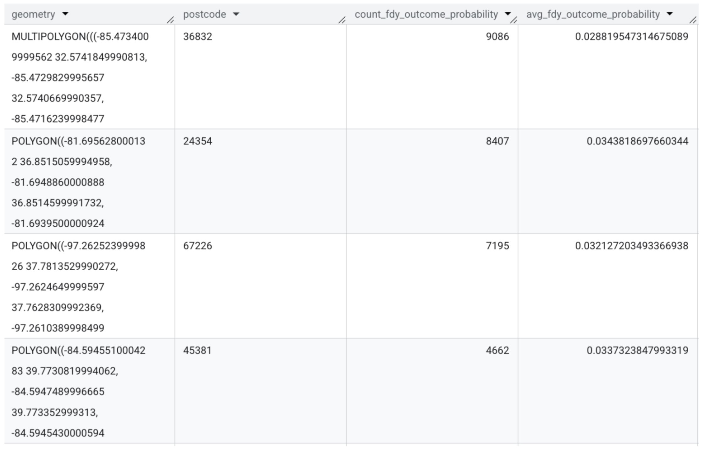
- Aggregated: Useful for geotargeted ads or planning, canvassing, direct mail and more, this format summarizes how many individuals fall into key groups (like a persona or outcome) per geographic area. You’ll get a row per geographic area, with counts of people per persona or outcome. In this row, data can be aggregated into the following categories: ZIP code, census tract, carrier route, county, metro area, state, etc.
- Identified: This format includes direct personal identifiers like name and address, allowing you to activate immediately through mailers, call centers, or CRM integrations. Because this format exposes PII, it’s only available in secure workflows with appropriate safeguards and permissions in place.
Column headers
You also get to choose how the column headers are labeled:
- Machine-friendly headers are concise and consistent, ideal for automated ingestion. Useful especially for our API users.
- Human-friendly headers spell things out a bit more, which can make it easier for marketers and other stakeholders to work with the data directly, especially in tools like CRMs or email platforms. For example, “
fdy_persona_set_{UUID}_persona_name” could appear as “fdy_persona_set_customers_persona_name” in human-readable mode.
3. Filters, limits, and structure tweaks
Filters
Filters allow you to narrow your deployment to just the segments of interest. You can filter by personas, outcomes (via percentile or probability), or even recommender results (such as top product matches). This is how you target only the individuals who matter most for a given campaign. For example, give me the top 10% of scorers for my outcome.
Limits
Need to limit the number of people you're deploying to? You can set a top or bottom row limit—useful for campaign budgeting, prioritization, or suppression.
📘Note: in preview mode, deployments are capped at 1,000 rows. We break down the difference between preview mode and a deployment later in this blog!
Structure
You can also rename or reorder columns to better match the formatting requirements of your destination platform. For example, if you're sending a list to LinkedIn or Facebook, you can use one of our pre-formatted options for easy compatibility.
4. Geography & “Add geometry”
When building a geotargeted campaign, geographic options and the “add geometry” setting come into play. You can define the geographic granularity—ZIP code, metro area, census tract, etc.—and include shape data for use in map-based planning or delivery platforms. This setting only applies to aggregated deployments.
If you’d like more information about how to read these outputs, just look at our recent blog which broke down how to read the labels!
5. Deployment analysis
Deployment analysis gives you a snapshot of what’s inside your deployment before you send it off. It includes summary stats on key traits and geographic distributions, delivered as a downloadable PDF or accessible via the API. This can help you validate that the list aligns with your goals—for example, checking that you’re really hitting the right income bands or urban areas before launching a campaign.
📘 Note: Access to traits in deployment analysis depends on your account permissions. If you’re not seeing the traits you need, reach out to your account manager to learn more about available options.
6. Score explainability
Finally, if you've selected prediction explanations during pipeline setup, your deployment can also include score explainability. This details which traits had the greatest influence on an individual’s predicted score. It’s useful for internal transparency, model evaluation, or even surfacing to customer-facing teams.
If you're not sure whether you've enabled or don’t know how to read it, reach out to your Faraday team, we’ll confirm or help turn it on.
7. Preview mode vs. full deployment
Before launching a full deployment, it’s helpful to run a preview—and it’s important to understand how previews behave differently. In preview mode, your deployment is capped at 1,000 rows, no matter what filters or limits you’ve set. This cap exists so you can sanity-check your configuration without triggering a full export. Once you’re ready to go live, the full deployment will reflect your entire population and apply all settings as specified—no artificial row limits included.
Wrap-up
Deployments are more than just the final step in your predictive workflow—they’re the bridge between insight and action. With the right configuration, you ensure your models aren’t just accurate, but actually useful—delivering the right predictions, in the right format, to the right destination.
David Small
As Head of Sales & Partnerships, Dave develops and executes strategies that emphasize mutual growth for Faraday’s partner ecosystem. He works closely with Faraday’s executive team on finding, developing, and growing new relationships across technology companies, lead generators, and agencies. Dave has spent his career in client facing roles, supporting the rollout of emerging technologies and high-impact marketing campaigns. He earned a BA in Sociology from Middlebury College and is based in Vergennes, Vermont.
Ben Rose
Ben Rose is a Growth Marketing Manager at Faraday, where he focuses on turning the company’s work with data and consumer behavior into clear stories and the systems that support them at scale. With a diverse background ranging from Theatrical and Architectural design to Art Direction, Ben brings a unique "design-thinking" approach to growth marketing. When he isn’t optimizing workflows or writing content, he’s likely composing electronic music or hiking in the back country.

Ready for easy AI?
Skip the ML struggle and focus on your downstream application. We have built-in demographic data so you can get started with just your PII.