How to interpret outcomes in Faraday
A short guide on how to interpret your predictive outcomes in Faraday.


At Faraday, we’re on a mission to help businesses of all kinds predict customer behavior. Whether you’re a credit union that wants to predict the next best offer for your current customers, a construction brand looking to increase lead conversion rates, a sales platform set on enhancing your product with customer predictions to increase rep efficiency–or anything in between–we’ve got you covered.
While we’ve taken great leaps in the 10+ years since our founding to make this type of data science more accessible to non-data-scientists, we know that it can still be a struggle to interpret what exactly you should pay attention to within your outcomes and recommenders so that you can use your customer predictions with maximum effectiveness.
To this end, let’s take a quick look at an example of the output of an outcome and highlight the exact pieces of info you can focus on so that you can understand how to activate on your predictions. For recommenders, check out our accompanying blog post.
Using the lift table
When you’re viewing an outcome, the lift table is one of the analysis options available to you, and a great place to start.
Every outcome has an average conversion rate — this is the portion of every eligible person that attained the outcome. Given a lead conversion outcome, for example, the average conversion rate is just the average lead conversion rate you’ve experienced to date.
In the lift table, you’ll find performance broken down by probability range into 10 groups, or deciles. The table sheds light on how likely people in each decile are to attain the outcome, including in comparison to that average attainment rate. The comparison of a given decile’s attainment rate to the average attainment rate is called lift, which you can see in the rightmost column. The higher the lift, the better the performance.
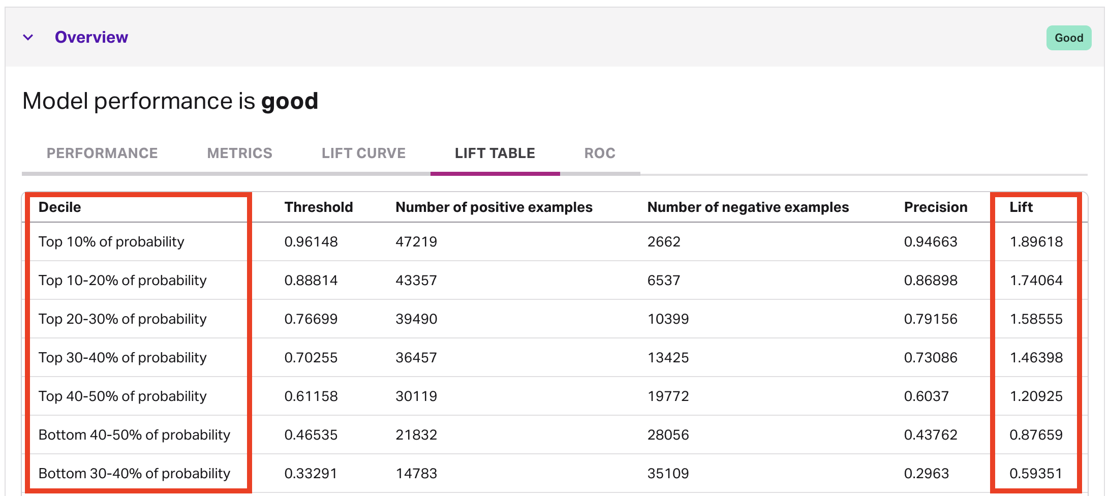
As you review the table, the columns you’ll want to keep an eye on are decile and lift. You can look at the lift on a scale around the value 1.0, which represents no change against your average conversion rate. When the lift moves positively away from 1.0, that means you’re in a decile that will do better than normal, while moving below 1.0 indicates the opposite.
To illustrate, look at the top decile — this contains the 10% of all people who scored highest. Faraday expects that out of everybody who receives a score this high, about 95% of them (the precision) will attain the outcome. This is way higher than normal for this outcome — in fact, about 90% higher (1.896x lift).
Choosing a cutoff
If you only pursue this top decile, you’ll have a great success rate, but you’d be leaving a lot of other potential attainers behind. When predicting customer behavior like this, an important job for a human is to decide where the cutoff point (“threshold”) should be.
In general, you can use this scale to determine which people in your pipeline’s eligible population you should focus more on, and which you should focus less on. In the above table, you can see a positive lift all the way to the top 50% of scorers.
When you create a deployment for your predictions, you can match this by applying a filter on the outcome’s probability percentile at “> 50,” ensuring you’re focusing on places where you’re likely to see positive lift.
Advanced users can leverage probability values, along with profitability, to determine a cutoff based on expected value (EV).
Andy Rossmeissl
Andy Rossmeissl is Faraday’s CEO and leads the product team in building the world’s leading context platform. An expert in the application of data analysis and machine learning to difficult business challenges, Andy has been running technology startups for almost 20 years. He attended Middlebury College and lives with his wife in Vermont where he lifts weights, makes music, and plays Magic: the Gathering.

Ready for easy AI?
Skip the ML struggle and focus on your downstream application. We have built-in demographic data so you can get started with just your PII.