Outcomes
Outcomes are predictions that tell you how likely individuals are to take virtually any action, such as convert or churn.
Outcomes overview
Outcomes are predictions that tell you how likely individuals are to take virtually any action, such as convert or churn. Within an outcome, you'll describe your business goal–lead conversion, customer churn, etc–through your cohorts, and Faraday will predict how likely individuals are to achieve that business goal. After you create an outcome, Faraday will create a likely-to-buy predictive model for that business goal by applying dozens of strategies to build a range of candidate models, then selecting the one that most accurately predicts your outcome.
Outcomes are built by choosing which cohort of people you want to score based on their likelihood to enter another cohort that you select. When creating an outcome, you'll choose cohorts for two core selections:
- Eligiblity: The eligibility cohort is who you want to be able to achieve this outcome.
- Attainment: The attainment cohort represents the "finish line" for the prediction–what cohort you want the eligiblity cohort to look like.
(Advanced) You can optionally configure an attrition cohort, which defines where individuals go if they don’t achieve the desired outcome. This is rarely needed and is now part of the outcome’s advanced settings. Learn more below →
Let's walk through an overall example using these cohorts: scoring leads based on the likelihood that they'll convert and become customers. In your outcome, you'll select the attainment cohort customers, as the goal of your outcome is that leads will enter the customers cohort and become customers. In most cases, you’ll leave the attrition cohort blank—this setting is reserved for edge cases and should only be used with clear intent. Lastly, your eligibility cohort will be your leads, as you're only interested in how likely it is that your leads will become customers. With these selections, Faraday will use your current customers as a baseline against which your leads will be scored on the likelihood that they'll become just like your customers.
Once your outcome is created, you're able to select it as a payload element in a pipeline–alongside other predictions you've made, like personas–so that you can apply the predictions you just made to a group of people. From there, you'll deploy your predictive outcome back to a connection you've made, or a CSV file.
For outcome creation instructions using both the Dashboard UI and API, see our how-to docs for the relevant likelihood prediction.
Learn more about how to interpret your outcomes, including suggested cutoffs for achieving positive lift, on our blog.
👍Key takeaway: outcomes
Outcomes are predictions that tell you how likely (or unlikely) individuals are to take virtually any action, such as convert or churn. While creating an outcome, you'll choose eligibility and attainment cohorts, where Faraday will predict the likelihood of anyone in the eligibility cohort entering the attainment cohort. An optional attrition cohort is available in advanced settings, but is rarely needed. Outcomes are then used as payload elements in pipelines to deploy predictions, and can help you prioritize which individuals are worth engaging first.
Creating an effective outcome
When creating an outcome, it's important to remember that the intent of your predictions shouldn't affect the configuration of the outcome. When choosing the eligibility and attainment cohorts (and optionally attrition in advanced settings), the goal is to tell the predictive model what to learn in your historical data. Here's an example to illustrate this:
A regional business focused on New England is interested in expanding into New York, and wants to find likely buyers. When creating their likely buyers outcome, their Customers cohort is the natural attainment cohort, as that's the business's finish line. Their eligiblity cohort, however, isn't Faraday's Everyone in the U.S. cohort, nor is it Everyone in New York.
Because they're a regional business, people outside of their region of operation have never had the opportunity to be eligible to convert–they've never been marketed to. This means that the correct eligiblity cohort for their outcome is Everyone in New England, as that's who they've historically marketed to, and who they have data on.
Once their outcome is built to reflect the people in their data, their pipeline can be configured so that the likely buyers outcome is in its payload, and the population to include is their desired Everyone in New York cohort, resulting in predictions for how likely people in New York are to buy their products.
Here are some basic rules that an effective outcome should follow:
- At least 100 of an outcome's attainers must be in the eligibility cohort (i.e. they are positive examples of attaining the outcome), otherwise the outcome will display a "does not contain sufficient valid members" error.
- We recommend at least 1,000 of these positive examples for maximum effectiveness.
- The cohort definition for attainment and eligibility (and in the very rare use case for attriters) should reflect all the restrictions that were considered at the time the data was collected. The reasoning for this is described just above this list.
- The eligibility cohort should only be restricted using Faraday Identity Graph (FIG) traits if there are legitimate eligibility restrictions that would otherwise prevent people from becoming attainers: e.g. people under 65 cannot purchase your insurance product.
- Keep this in mind when using cohorts with FIG traits applied as filters in your outcomes.
- While not necessarily a rule, an outcome that has been trained on more recent data will likely perform better than an equivalent outcome trained on older data in a real-world scenario, even if the older one scores higher.
- For example, if you have a lead conversion outcome whose eligibility cohort is leads and attainment is customers, whose score is 85. The outcome then receives new data from the last 3 months (either from your data or Faraday's), which forces the outcome to re-train, and the resulting updated score is 80. This doesn't guarantee that the older model is better simply because its score is 5 points higher. More recent data is often a better indicator of real-world performance than a raw outcome score when the scores are relatively close.
Advanced use of attrition cohorts
The attrition cohort is a specialized feature used to define where individuals are placed if they don’t reach the attainment cohort. This is most useful in cases where you want to explicitly track failed outcomes as a distinct group—for example, a subscription cancellation or application rejection.
Most outcomes do not require attrition. If you’re unsure whether you need it, it’s safest to leave it blank.
Attrition is now configured under advanced settings in the outcome builder UI to reduce confusion. If you think you have a use case for it, we recommend consulting with your account manager before use.
Analyzing an outcome
Once your outcome is complete and its status is ready, various features to analyze will populate in the outcome. This includes the performance of the model (through the score, lift table, lift curve, and ROC), or what kind of results you can expect when using this outcome, as well as the data features that were most important during the predictive model's build. Dynamic prediction indicates that each section will include breakdowns based on how long the individuals in the outcome were in the cohort in question.
📘What is lift?
Lift is an indicator of how well the model is predicting positive examples–people entering the attainment cohort of your outcome–over a random choice from the eligility cohort. It is presented as a numeric value, and the higher the value, the better the model is at identifying likely converters amongst the eligible population. In many cases, lift above 1.0, or positive lift, is worth pursuing.
Outcome performance
Each outcome's default tab is performance. This tab provides a chart that includes a score based on its ability to predict the outcome versus predicted lift. The closer the performance score to the upper right, the better the performance you can expect in a real-world use case. The available scores can be seen below.
- Misconfigured: This can happen when your cohorts have too few people in them to make meaningful predictions.
- Low: Some lift might be generated, but since signal strength is low, performance may not be consistent. This could mean that we can't easily distinguish between positive and negative examples due to them being too similar (e.g. very similar age, gender, etc), or being too dissimilar (within a given cohort).
- Fair: Lift should be generated, and this is definitely better than random. For example, if your average lead conversion rate is 3%, you can likely expect a pipeline using this outcome to produce a higher conversion rate.
- Moderate: Some signal is present, and the model should be usable, but lift may be limited. Moderate outcomes can still provide value, especially if your goal is directional or if your use case has limited training data.
- Good: Lift should be generated with some consistency.
- Great: Lift should be generated reliably.
- Excellent: Strong lift should be generated reliably.
- Warning: Your outcome is predicted better than we would typically expect. You should check that only predictors known prior to the outcome are included. In other words, the model's performance is too good to be true. This can happen when the model calls on first-party data that's directly related to the outcome. If your model reports this, ask support for assistance.
📘Getting the most out of an outcome score
To get the most out of your predictions, it's recommended that you select a deployment filter for outcome probability based on the lift table's threshold column for your desired lift.
Additionally, each outcome includes other performance metrics through which you can assess how an outcome is performing. These metrics are displayed in the Faraday app as well as the full technical report, which is available via the three dots in the upper right, then the full technical report button.
Metrics
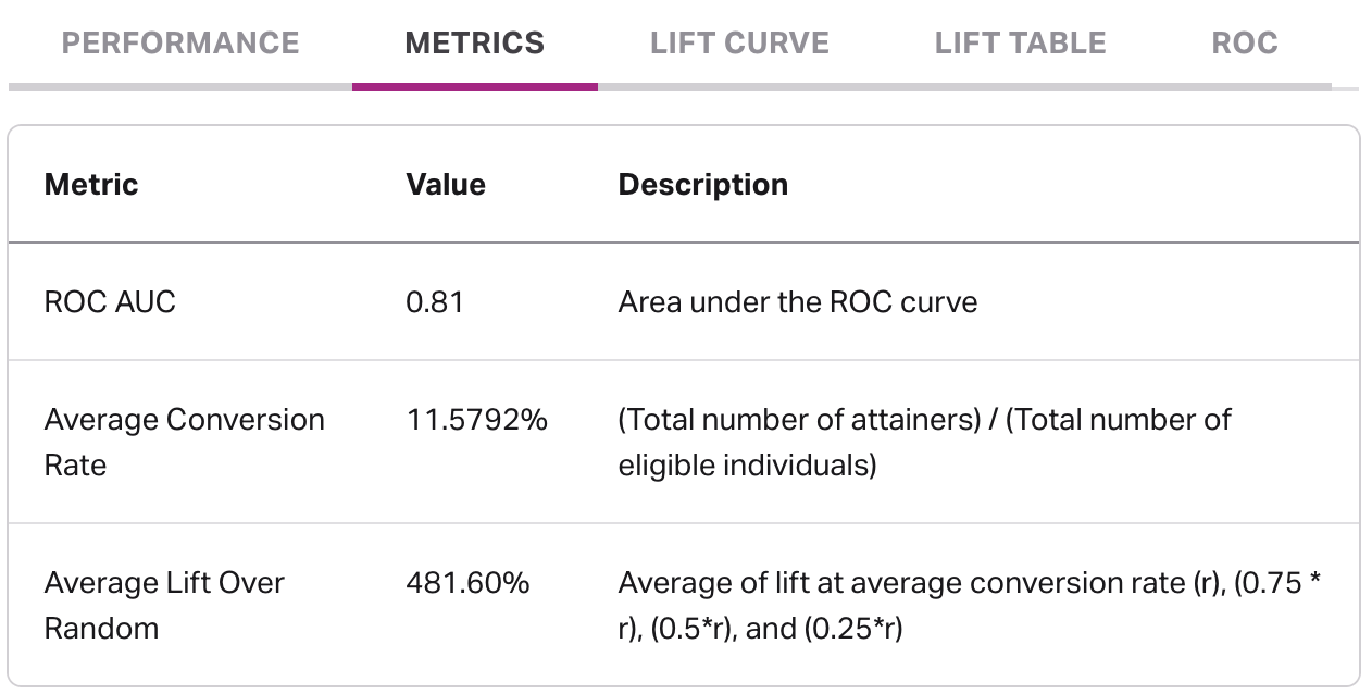
The metrics tab includes various metrics to help assess model performance, including ROC AUC value, average conversion rate, and average lift over random.
- ROC AUC: ROC AUC is a score, on a scale of 0.0 to 1.0, that helps determine how well a model is performing. An ROC AUC of less than 0.5 indicates a configuration error. An ROC AUC of 0.5 indicates that the results are no better than a random guess, which means that the model is performing very poorly and is very unlikely to properly identify future conversions. On the other end, an ROC AUC of 1.0 indicates that the model is likely too good to be true, thus an ideal ROC AUC should be in somewhere in the middle.
- Average conversion rate: Average conversion rate is the number of individuals that were eligible and became attainers, divided by the number of individuals in your eligibility cohort. This value, when used with values from the lift table can help you calculate the conversion rate you might expect per decile when using these predictions.
- Average lift over random: Similar to ROC AUC, the value in average lift over random aims to quantify the benefit of using this outcome as opposed to not using predictions at all within a single number, therefore higher numbers often indicate better performance.
📘How to calculate predicted conversion rate
You can calculate a given decile's (e.g. top 20% of scorers) predicted conversion rate by following the below formula. In the formula, ACR represents average conversion rate, found in the metrics tab.
The average conversion rate (ACR) is equivalent to not using predictions at all, and lift * average conversion rate is equivalent to Faraday's added value. As an example, using the above formula, if you have an average conversion rate of 10%, and your top 20% of scorers have a lift of 5.0 per the lift table in an outcome, the formula would look like 10 + 5 * 10, resulting in a 60% predicted conversion rate for your top 20% of scorers in this outcome.
Lift curve
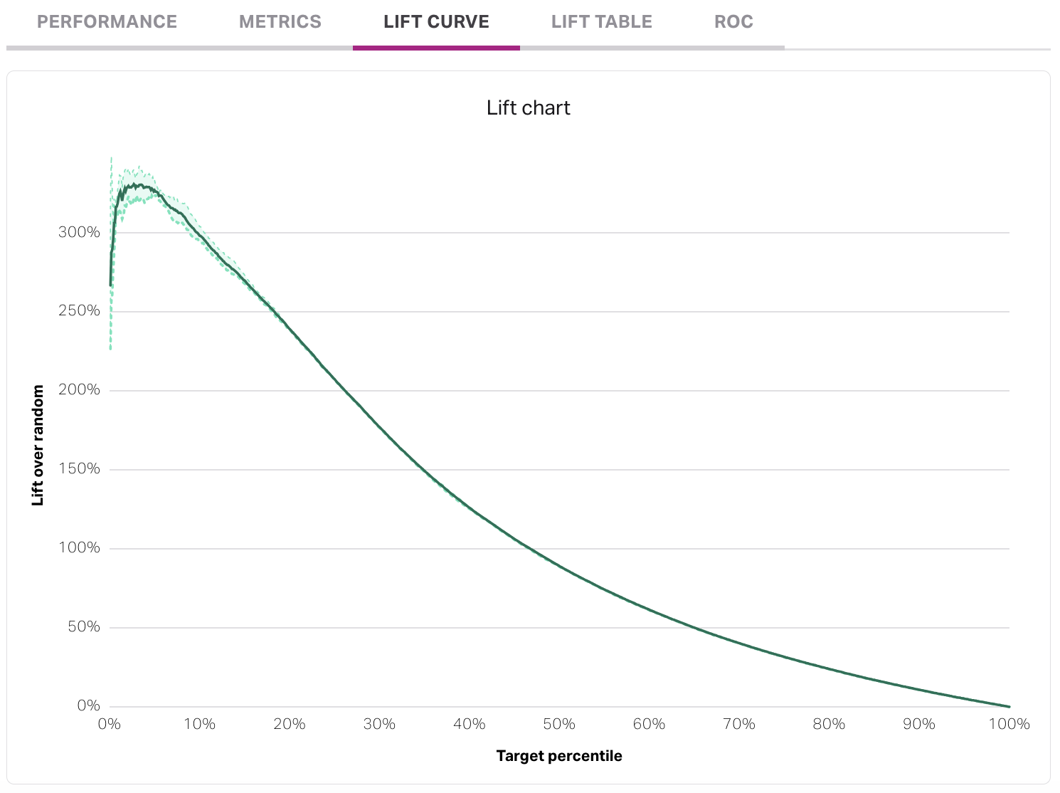
The lift curve measures the estimated lift within each target percentile. The X-axis, target percentile, indicates the fraction of the people that have moved from the eligiblity to attainment cohort that is being captured. A well-performing lift curve will generally have a strong "bump" up the Y-axis that represents the highest-scoring individuals in the outcome (the left-hand side of the X-axis).
Lift table
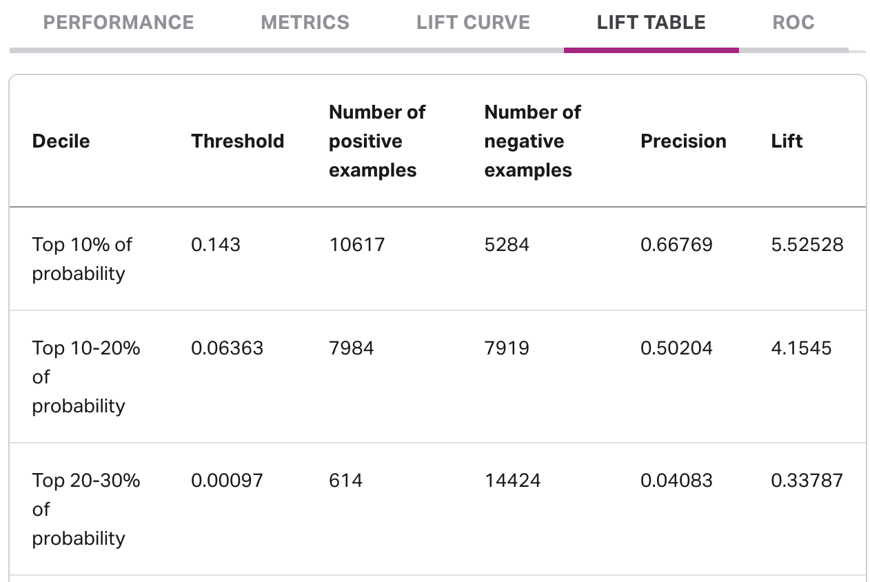
The lift table provides an alternate view of the lift curve, in which each decile of scorers is given its own row. Each row includes:
- The specific decile (e.g. top 10% of scorers).
- The probability threshold, which can be used to customize deployment filtering in a pipeline. Once you determine the deciles you want to include in your deployment, create a deployment, choose outcome probability as a filter type, and enter the threshold.
- The number of positive examples, or the individuals who have successfully completed the journey from the eligiblity to attainment cohorts.
- The number of negative examples, or those still in the eligibility cohort who have yet to complete the journey to attainment.
- The precision, which is a way to quantify how good the model is at putting the positive examples in the given decile at the highest ranks of scoring.
- The lift, which is an indicator of how well the model is predicting positive examples over a random choice from the eligility cohort.
ROC
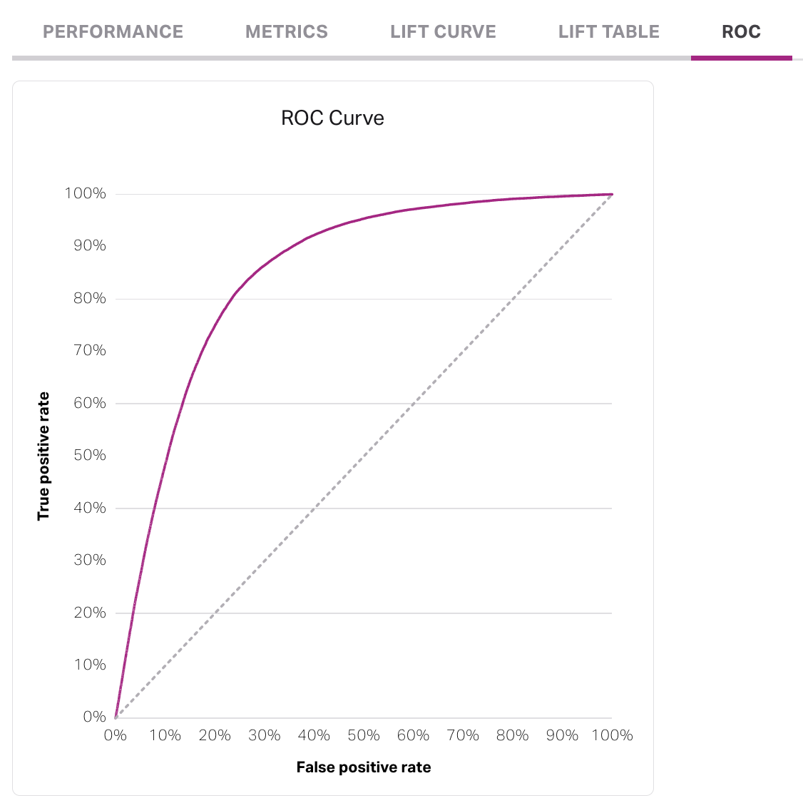
The ROC curve measures how well a model is performing. A well-performing will curve toward the Y-axis of true positive rate (TPR) before leveling out at 100%, as the TPR tells you how well the model is predicting true positives, or individuals from the eligibility moving to the attainment cohort. The dotted line represents a model that is as good as a random guess, or a coin-flip.
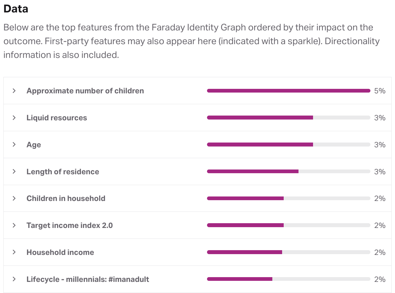
Outcome data
The data section of an outcome breaks down the top features or traits used in creating the outcome, ordered by their level of impact. These can include features from both your first-party data (indicated by a sparkle) and the Faraday Identity Graph. Each feature that had an impact on the outcome will be assigned a percentage based on its level of impact.
By expanding a feature, you'll see its directionality, or the impact the feature has on the score of individuals in the eligiblity cohort. Each feature's directionality is broken down into different bins based on how the feature in question is broken down. For example, the age feature will include bins for people age 18-31, 31-37, etc.
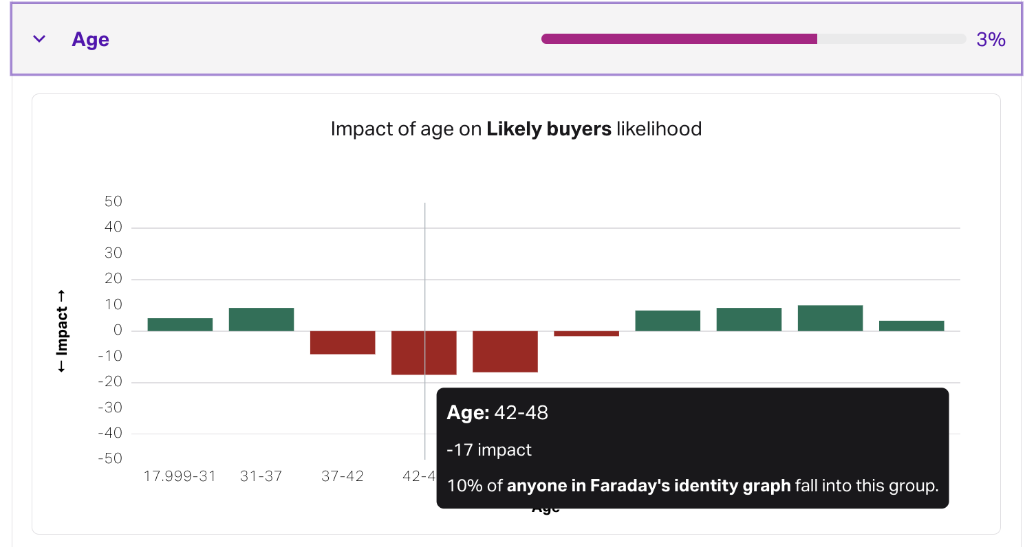
In the above example, if an individual is 45 years old, the directionality of their corresponding age bin is -17, so–for a population of 100 people–this individual would rank on average 17 ranks lower than the average scored individual. This is a rather negative impact on their predictive score for the outcome.
Exceptions
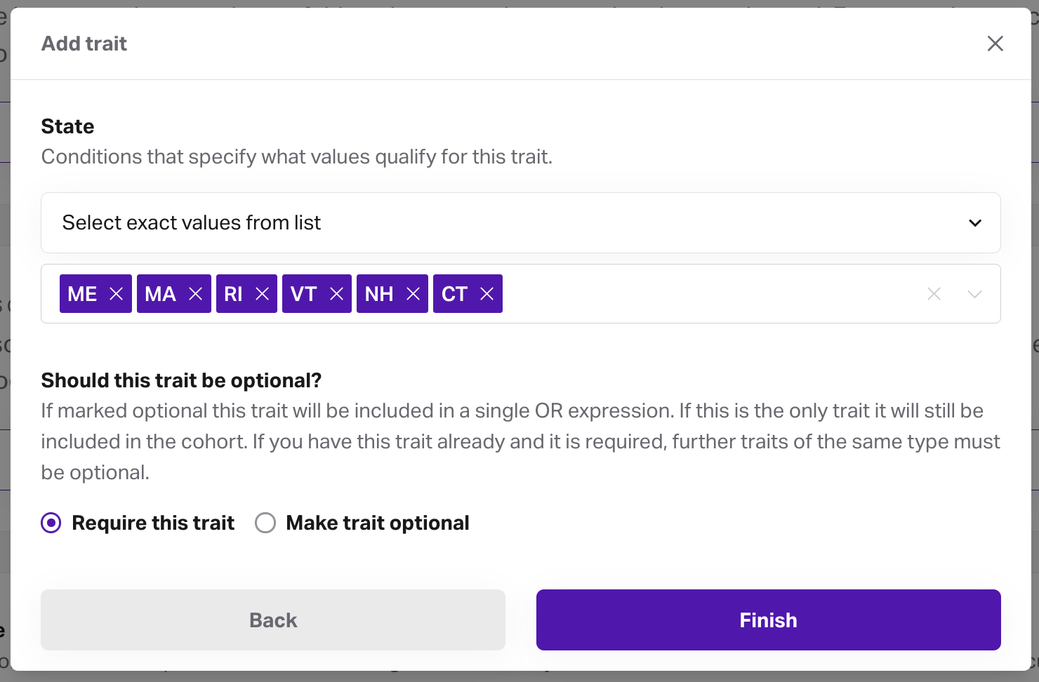
The data section also includes any exceptions that are selected when creating or editing an outcome. Exceptions allow you to prevent the outcome from using certain traits while building the outcome, and can be made for both Faraday traits, and first-party traits defined from your data. You can add exceptions for all protected class traits via the checkbox, or add individual exceptions via the add trait button.
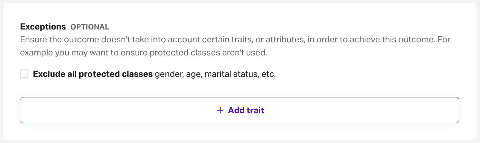
This can be useful for excluding protected classes, such as age and gender, from your predictions so that you can remain compliant to relevant laws & regulations.
Outcome bias
Each outcome you create includes a section that breaks down any bias that Faraday detects in your predictions and the data that was used for them, including a summary tab for an at-a-glance overview.
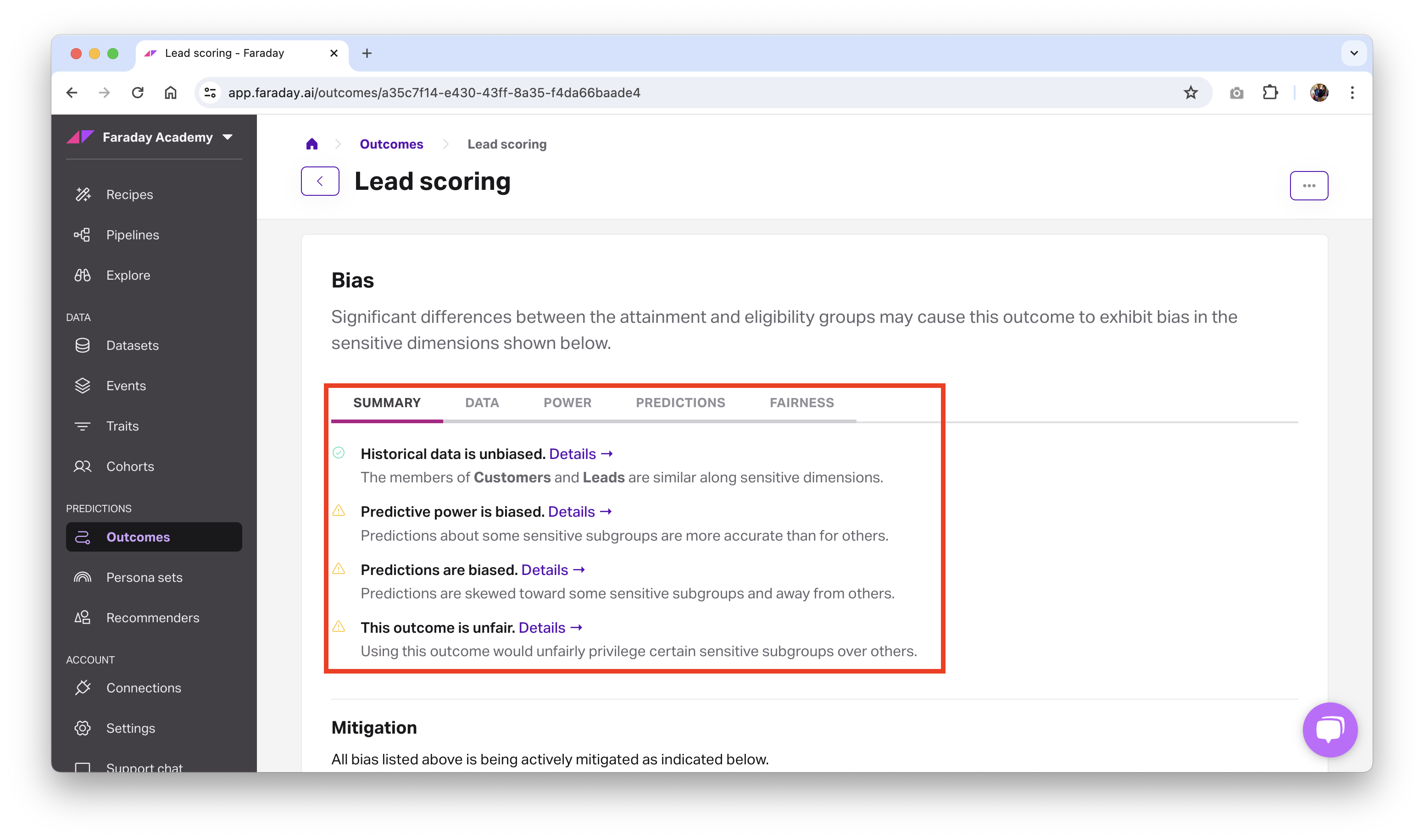
Bias reporting is broken down into four categories: data, power, predictions, and fairness.
-
Data: The underlying data used to build an outcome can introduce bias by unevenly representing subpopulations. This bias is measured by comparing distributions of sensitive dimensions across labels. Categorical distributions (e.g. for gender) are compared using proportions. Numeric distributions (e.g. for age) are compared using a normalized Wasserstein distance on the space of empirical distributions.
-
Power: A subpopulation is a subset of the eligible population defined by a set of sensitive dimensions (e.g. age and gender) and values (e.g. adult and female).
Outcome performance can be measured for a subpopulation and compared to the overall performance on the entire population.
-
Predictions: Outcome predictions can target subpopulations with bias. Measuring that targeting discrepancy fall under this heading.
-
Fairness: Fairness metrics aim to give an overall picture of how a subpopulation is treated. There are many metrics in the literature and the appropriate metrics depend on the specific situation.
By clicking details in the summary tab next to a category–or the tab itself–you can see the level of bias that was detected for that category.
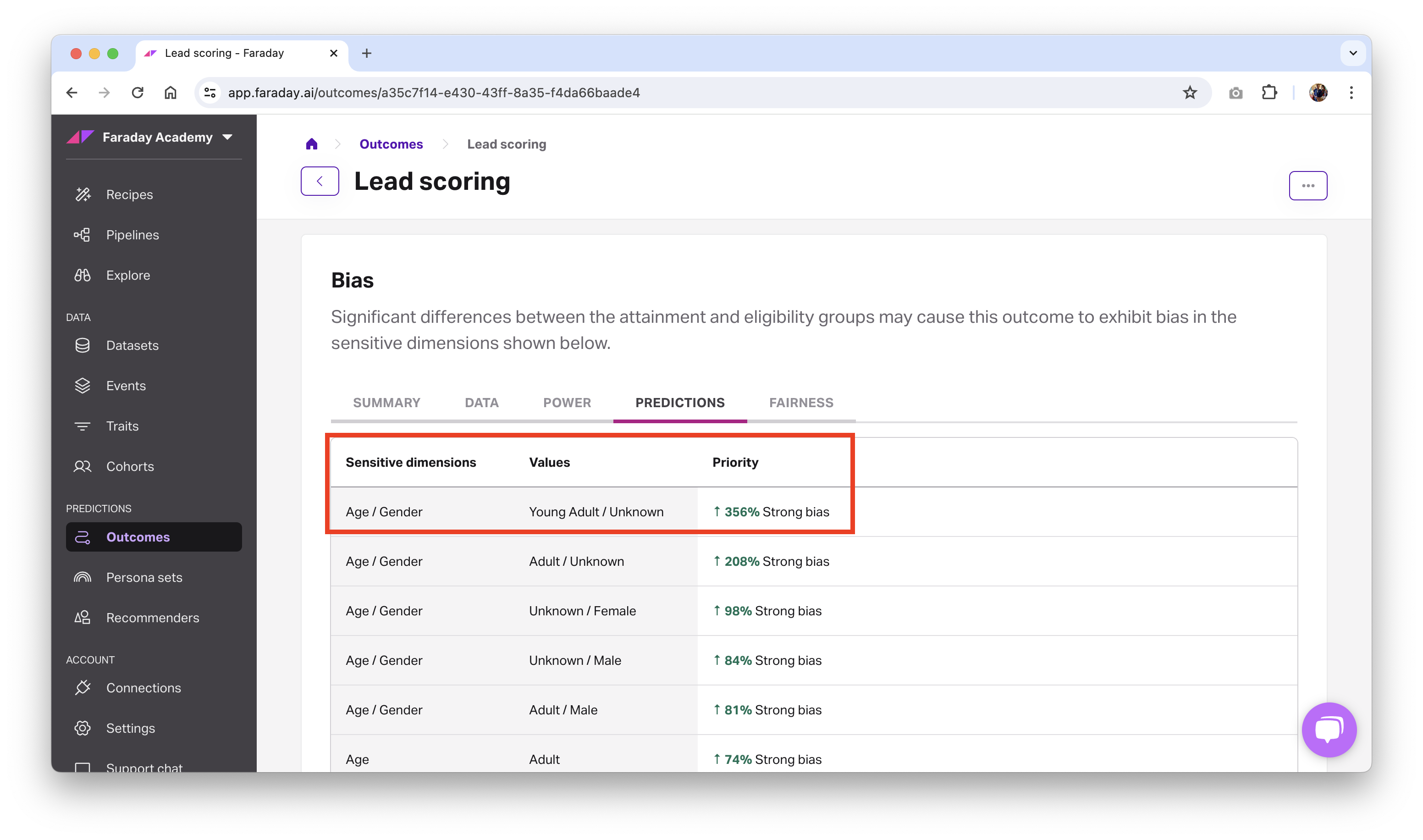
In the above example, Faraday found that this lead conversion outcome had a strong favorable bias (indicated by the green arrow) toward people in the sensitive dimensions breakdown of senior/male. Expand the table below to see how each sensitive dimension breaks down into its subgroups.
Sensitive dimensions breakdown
| Sensitive dimension | Subgroup | Value |
|---|---|---|
| Age | years old | |
| Teen | 0-21 | |
| Young Adult | 21-30 | |
| Adult | 31-40 | |
| Middle Age | 41-60 | |
| Senior | 60+ | |
| Gender | ||
| Male | ||
| Female | ||
| Unknown |
Mitigating bias
When you find that an outcome of yours has bias being reported that you'd like to address, you can apply bias mitigation strategies to mitigate or reverse the bias.
Currently available bias mitigation strategies:
- None: Ignore bias
- Equality: Neutralize bias.
- As an example, if you have 48% men in the outcome's eligiblity cohort, and you mitigate gender using equality, then any output of a pipeline using the mitigated outcome will have 48% men and 52% women.
- For equality, the basis is to preserve the distribution from the eligible population, which means that you don't want your outcome to create bias by ranking people of a certain subpopulation higher than another.
- As an example, if you have 48% men in the outcome's eligiblity cohort, and you mitigate gender using equality, then any output of a pipeline using the mitigated outcome will have 48% men and 52% women.
- Equity: Invert bias.
- For equity, in a perfectly fair world, each subpopulation in the outcome's eligibility cohort is of the same size (e.g. 33% Senior Male, 33% Young Female, 33% Teens with Unknown gender). If one of these subpopulations–Senior Male, for example–is 52% of the overall population in the eligiblity cohort, it's 19% too large. Because it's 19% too large, Faraday shrinks it by 19% from the ideal 33%, which is roughly 14%. This process repeats for each subpoplation.
- At the end of this process, Faraday over-promotes rarer classes so that the target population of your predictions ends up being made of more people from the originally under-represented populations. From a business standpoint, this serves two purposes:
- Prevents your marketing campaign from being trapped in a vicious circle (i.e. I market more to middle-aged men, therefore I sell more to middle-aged men, therefore I should market more to middle-aged men.)
- Allows you to identify which under-marketed population has the best potential to convert.
🚧️With great power...
Mitigating bias isn't something you should set-and-forget, meaning it's not recommended that you toggle both age and gender on for every single outcome you create. For example, if you're a womens' swimwear brand, your data will skew heavily toward women, and mitigating gender would negatively impact your lift, so in this case you would not want to mitigate.
In general, using equality to neutralize any bias discovered is the most common use case for bias mitigation in cases where you do want to actively mitigate (see warning above). It's often helpful, if you have outcomes available, to create a new outcome when applying a bias mitigation strategy for easy comparison.
📘Bias mitigation: further reading
For further reading on how Faraday mitigates bias, including bias mitigation's impact on projected lift, read our blog: How Faraday helps mitigate harmful bias in machine learning
Deleting or archiving an outcome
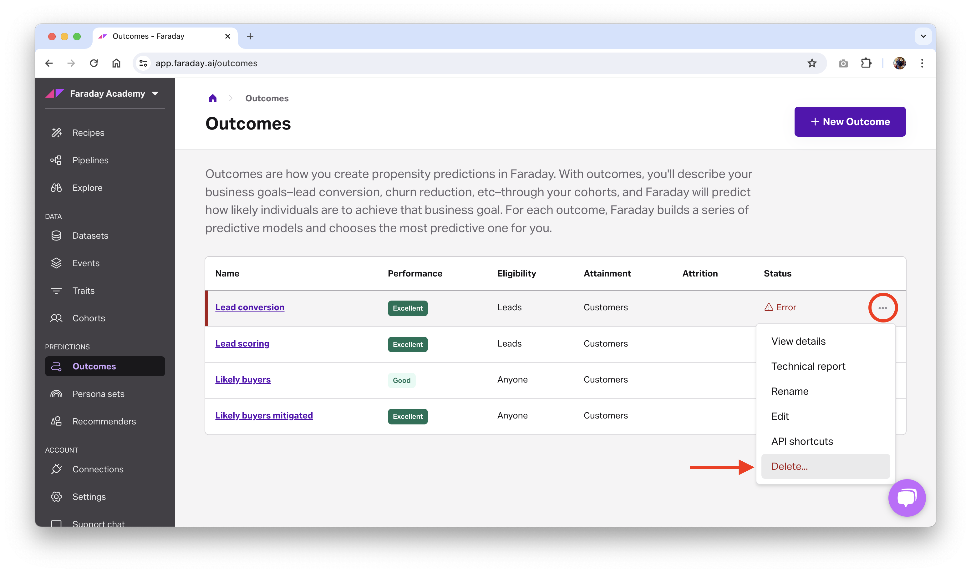
Before deleting an outcome, ensure that resources using it, such as a pipeline, are no longer using it. Once there are no other resources using the outcome, you can safely delete it.
- Dashboard: click the ... menu on the far right of the outcome you'd like to delete or archive (or upper right while viewing a specific one), then click the relevant option.
- API: use the delete outcome or archive outcome API requests.
📘Deleting and archiving resources
See object preservation for more info on deleting and archiving resources.